Admin panel dark mode
1344×768 · AVIF · CC BY 4.0
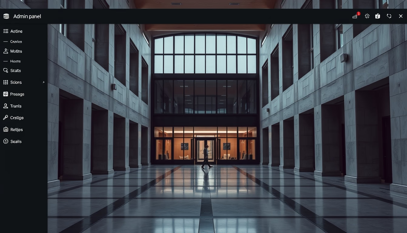
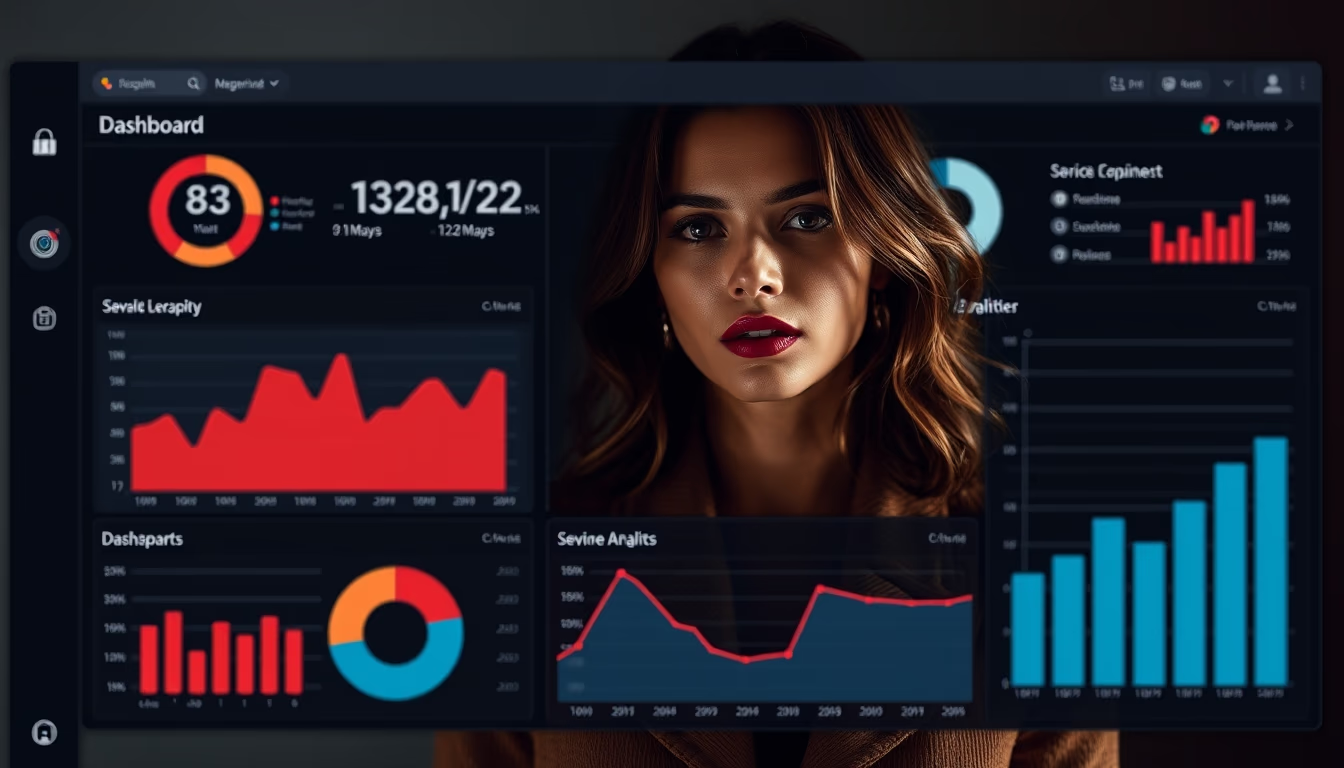
Admin panel in dark mode: explore design trends, usability, and influences of architectural photography on SaaS interfaces.
About this subject
Admin panels are the command center of SaaS applications. The choice between light and dark mode goes beyond aesthetics: dark mode reduces eye strain in low-light environments and can save battery life on OLED screens. Studies indicate that 80% of developers prefer dark IDEs, and this preference extends to corporate dashboards.
The influence of architectural photography on interface design is subtle but striking. Clean lines, controlled contrast, and emphasis on depth, hallmarks of modern building photos, are replicated in dark mode admin panel layouts. The use of cards with soft shadows and subtle gradients mimics natural lighting in architectural spaces, creating a sense of order and professionalism.
2025 data shows that 60% of new SaaS products offer a dark theme option, and platforms like GitHub, Slack, and Twitter have adopted dark variants. For designers, the challenge is maintaining readability: contrast ratios must follow WCAG 2.1 guidelines (minimum 4.5:1 for normal text). Palettes with bluish grays (e.g., #1e1e2e) are common, as they reduce visual fatigue more than pure blacks.
Fun fact: the term 'dark mode' gained popularity after iOS 13 in 2019, but operating systems like macOS (Mojave) and Windows (10) already offered the feature. In admin panels, the trend is to combine dark mode with vibrant color microinteractions (e.g., yellow or red notifications) to direct user attention.
Frequently Asked Questions
Why is dark mode so popular in admin panels?
Dark mode reduces eye strain, improves readability in low light, and saves battery on OLED screens. Many developers and IT professionals also prefer it for a modern, sleek look.
What are the best contrast practices for a dark mode admin panel?
Follow WCAG 2.1 guidelines: minimum 4.5:1 for normal text and 3:1 for large text. Avoid pure black (#000000); use dark grays (e.g., #1e1e2e) to reduce eye fatigue.
How does architectural photography relate to interface design?
Both emphasize clean lines, balance, and depth. In admin panels, subtle shadows and gradients mimic natural lighting in architecture, creating an organized and professional visual experience.
Direct URL
https://pub-c7d6a6ea828543ac903a74a341ccb2e1.r2.dev/imagens/admin-panel-dark-mode-architectural-photography-p0.avifHow to credit
Include a visible link back to UtilizAí. Copy one of the snippets below:
<a href="https://xn--utiliza-eza.com/en/midia/imagens/admin-panel-dark-mode-architectural-photography-p0">Admin panel dark mode</a> by <a href="https://xn--utiliza-eza.com">UtilizAí</a>, licensed under <a href="https://creativecommons.org/licenses/by/4.0/">CC BY 4.0</a>.
[Admin panel dark mode](https://xn--utiliza-eza.com/en/midia/imagens/admin-panel-dark-mode-architectural-photography-p0) by [UtilizAí](https://xn--utiliza-eza.com), CC BY 4.0
License: CC-BY-4.0