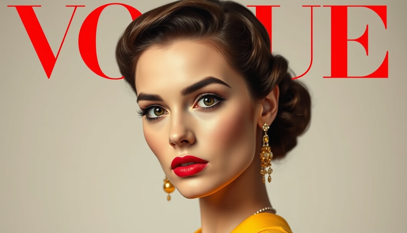
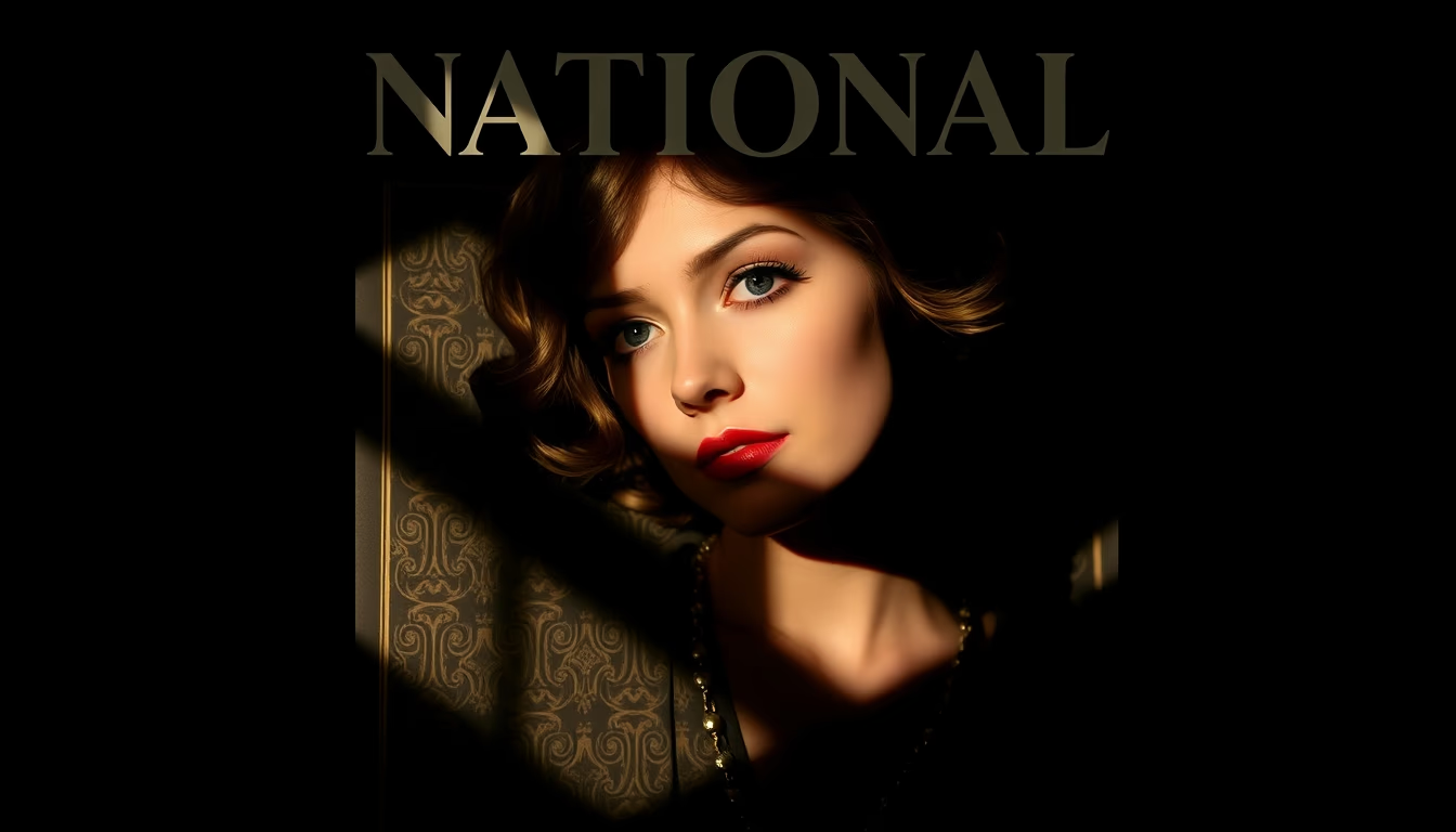
National magazine 1920s cover
1344×768 · AVIF · CC BY 4.0
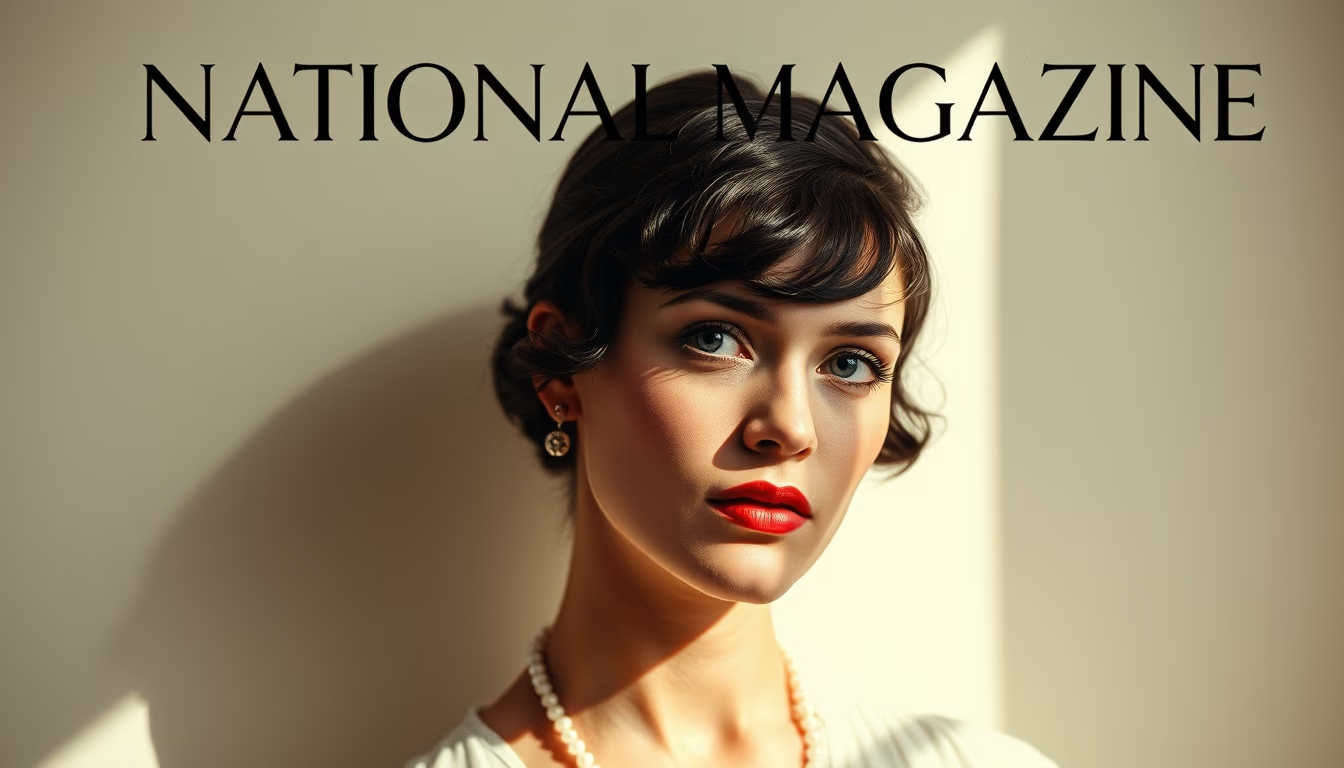
1920s national magazine cover with minimalist composition. Design influenced by Art Deco, bold typography, and striking negative spaces.
About this subject
During the 1920s, national magazine covers underwent a significant visual transformation. The Art Deco style, with its geometric shapes and elegant lines, dominated editorial design, replacing the ornate Victorian styles of the early century. Covers began to value simplicity, with central illustrations or photographs surrounded by ample negative space, creating a contrast that attracted the reader's eye.
This shift accompanied the optimistic post-World War I spirit, with the rise of mass culture and consumerism. Magazines like National Geographic and Time (launched in 1923) adopted cleaner covers, using bold typography and contrasting colors. The minimalist composition was not just aesthetic; it reflected a new era of visual communication, where the message should be clear and impactful.
Interestingly, the use of color photographs was still rare and expensive. Many covers used watercolor illustrations or engravings, but black-and-white photography with manual retouching was already being experimented with. Layout followed a geometric grid, with the magazine title usually at the top and the main image occupying two-thirds of the page. This layout influenced later generations of graphic designers.
The combination of Art Deco and minimalism on 1920s covers marked a milestone in editorial design history. They capture the transition to modernity, balancing art and information in an innovative way.
Frequently Asked Questions
Which national magazines from the 1920s are famous for their minimalist covers?
Magazines like National Geographic, Time (founded in 1923), and Vanity Fair adopted covers with clean compositions, influenced by Art Deco. National Geographic, for instance, began using color photographs on covers in 1914, but it was in the 1920s that the design became more minimalist.
How did Art Deco influence magazine cover design in the 1920s?
Art Deco brought geometric shapes, symmetry, and elegant straight or curved lines. Covers started using decorative frames, sans-serif fonts, and vibrant colors, but with a balanced layout and intentional empty spaces, creating a modern and sophisticated look.
Why are 1920s magazine covers considered minimalist?
Because they prioritized simplicity and visual clarity. Instead of many decorative elements, they used a strong central image, prominent title, and ample negative space. This approach contrasted with Victorian and Edwardian covers full of details, reflecting the modernist aesthetic of the time.
Direct URL
https://pub-c7d6a6ea828543ac903a74a341ccb2e1.r2.dev/imagens/national-magazine-1920s-cover-minimalist-composition-fresh4.avifHow to credit
Include a visible link back to UtilizAí. Copy one of the snippets below:
<a href="https://xn--utiliza-eza.com/en/midia/imagens/national-magazine-1920s-cover-minimalist-composition-fresh4">National magazine 1920s cover</a> by <a href="https://xn--utiliza-eza.com">UtilizAí</a>, licensed under <a href="https://creativecommons.org/licenses/by/4.0/">CC BY 4.0</a>.
[National magazine 1920s cover](https://xn--utiliza-eza.com/en/midia/imagens/national-magazine-1920s-cover-minimalist-composition-fresh4) by [UtilizAí](https://xn--utiliza-eza.com), CC BY 4.0
License: CC-BY-4.0