Dashboard analytics modern
1344×768 · AVIF · CC BY 4.0
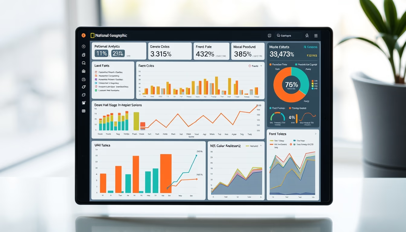
Modern analytics dashboards transform raw data into actionable insights with dynamic and interactive visualizations, essential for SaaS decision-making.
About this subject
A modern analytics dashboard goes far beyond static charts. It integrates real-time data streams, offers dynamic filters, and enables drill-down into metrics like monthly recurring revenue (MRR), churn, and customer lifetime value (CLV). SaaS companies use these tools to monitor business health, identify bottlenecks, and predict trends with embedded machine learning.
In the National Geographic style, data visualization gains narrative power: heat maps, bubble charts, and timelines tell stories about user behavior. Platforms like Tableau, Power BI, and Metabase have popularized this concept, but the market now demands responsive, collaborative dashboards with smart alerts. A data-driven culture requires every metric to be one click away, without needing SQL knowledge.
Dashboard evolution mirrors the data explosion: by 2025, an estimated 200 zettabytes of data will be in circulation. Modern analytics tools use in-memory processing and caching to respond to queries in milliseconds. Integration with SaaS APIs (Stripe, HubSpot, Salesforce) automates weekly reports, freeing analysts for strategic tasks.
Interestingly, the dashboard concept was born in 1985 with Boeing's first digital control panel. Today, the challenge is balancing dense information with visual simplicity: vibrant colors, clean typography, and clear hierarchy prevent cognitive overload. A good dashboard not only displays data but guides the user to the right action.
Frequently Asked Questions
What are the main KPIs a SaaS analytics dashboard should display?
Key KPIs include Monthly Recurring Revenue (MRR), churn rate, Customer Acquisition Cost (CAC), Lifetime Value (LTV), and Net Promoter Score (NPS). A good dashboard shows these metrics over time and segmented by product or region.
What is the difference between static and interactive dashboards?
Static dashboards are images or PDFs capturing data at a fixed point. Interactive dashboards allow filtering, clicking for details, and real-time updates, offering deeper analytical depth.
How does the National Geographic style influence data visualization?
The National Geographic style emphasizes visual storytelling, vibrant colors, and detailed maps. In dashboards, this translates to charts that tell stories, such as heat maps showing user density or timelines explaining trends.
Direct URL
https://pub-c7d6a6ea828543ac903a74a341ccb2e1.r2.dev/imagens/dashboard-analytics-modern-national-geographic-style-p4.avifHow to credit
Include a visible link back to UtilizAí. Copy one of the snippets below:
<a href="https://xn--utiliza-eza.com/en/midia/imagens/dashboard-analytics-modern-national-geographic-style-p4">Dashboard analytics modern</a> by <a href="https://xn--utiliza-eza.com">UtilizAí</a>, licensed under <a href="https://creativecommons.org/licenses/by/4.0/">CC BY 4.0</a>.
[Dashboard analytics modern](https://xn--utiliza-eza.com/en/midia/imagens/dashboard-analytics-modern-national-geographic-style-p4) by [UtilizAí](https://xn--utiliza-eza.com), CC BY 4.0
License: CC-BY-4.0