National magazine 1920s cover
1344×768 · AVIF · CC BY 4.0
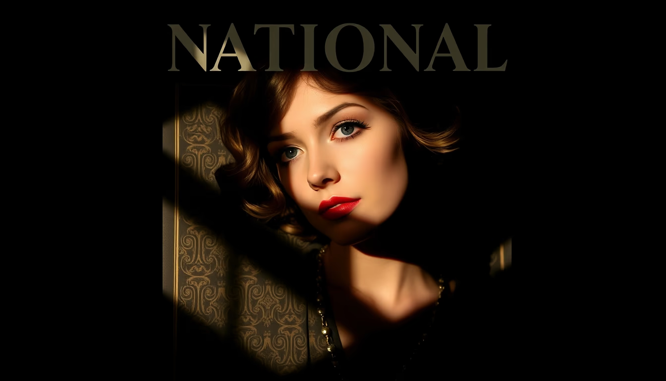
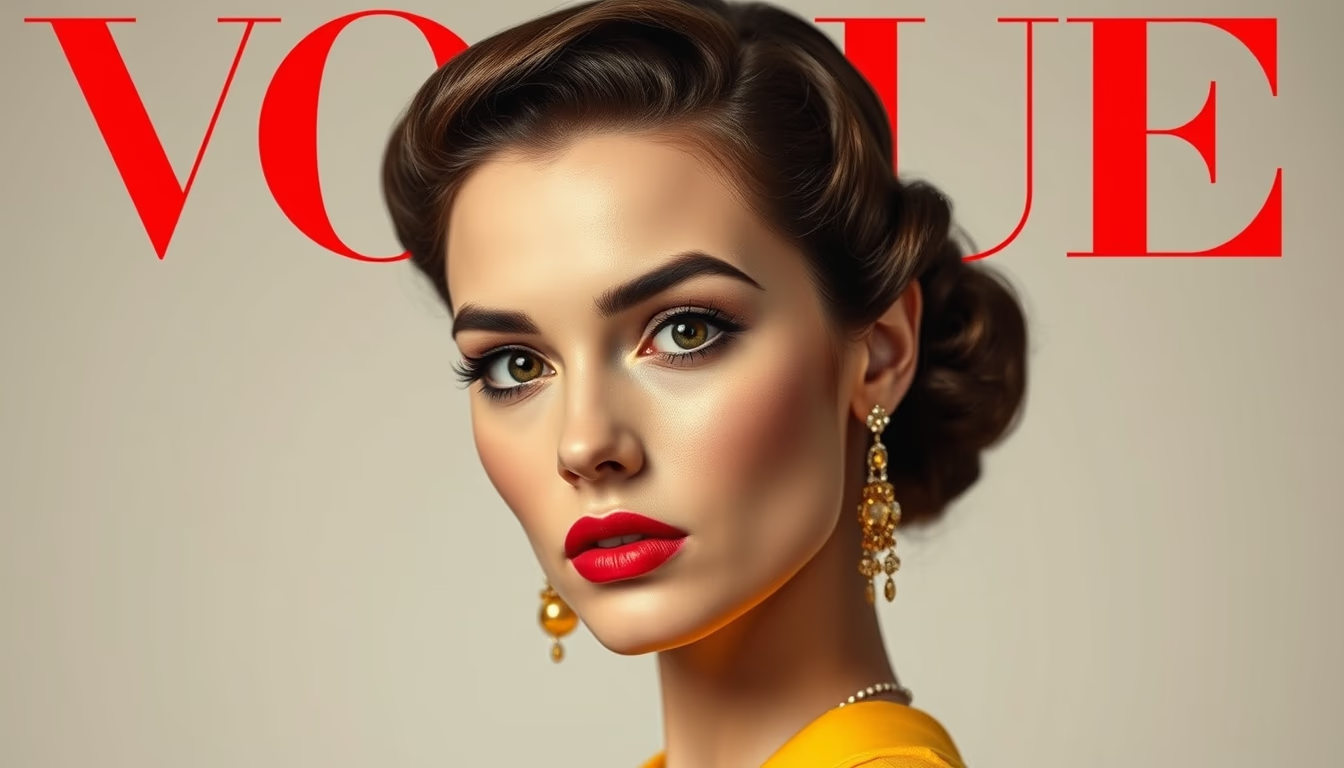
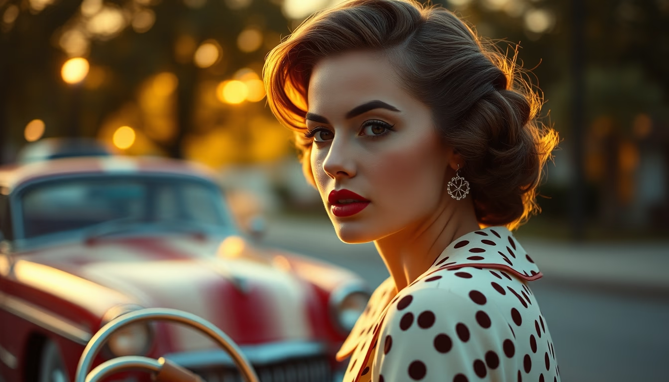
A 1920s national magazine cover blending Art Deco graphic design with Rembrandt lighting influence, creating dramatic shadows and visual sophistication.
About this subject
Illustrated magazines of the 1920s experienced a golden age, driven by rising consumerism and the popularization of photography. Covers like this are striking examples of editorial design from the era, where the Art Deco aesthetic dominated with its geometric forms, elegant lines, and stylized typography. The Rembrandt lighting technique, characterized by a single light source that creates a triangle of shadow on the unlit side of the face, was borrowed from 17th-century Dutch painting and adapted to portrait photography. This approach gave images dramatic depth and an air of mystery, highly valued in portraits of celebrities and public figures.
In Brazil, magazines like 'O Cruzeiro' and 'Manchete' (though the latter came later) followed international trends but with a local touch. The cover in question likely belongs to a widely circulated publication, reflecting the glamour and modernity of the 1920s. The use of strong shadows and contrast was not merely aesthetic: it helped the central figure stand out amid advertisements and other graphic elements on newsstands. Rembrandt lighting required technical skill from the photographer and specific equipment, such as reflectors and diffusers, which were less accessible at the time.
The legacy of these covers persists in contemporary design. The combination of dramatic lighting with geometric composition has influenced everything from film noir to current advertising campaigns. For collectors, original 1920s covers are rare and valuable items, preserving not only graphic art but also the cultural memory of a decade of social and technological transformation.
Frequently Asked Questions
What is Rembrandt lighting and why was it used on 1920s magazine covers?
Rembrandt lighting is a photographic technique that creates a triangle of light on the cheek opposite the light source. In the 1920s, it was used in portraits to add drama and sophistication, emphasizing facial expressions and complementing the Art Deco design of the covers.
What are the main features of 1920s magazine cover design?
1920s covers combined illustrations or photographs with stylized typography, geometric shapes, and contrasting colors. The Art Deco style prevailed, with elegant lines and modern ornamentation. Dramatic lighting was common to attract attention.
Why are 1920s magazine covers historically significant?
They document the visual culture and social values of the era, such as glamour, modernity, and consumerism. They also represent a milestone in the evolution of editorial design and advertising photography.
Direct URL
https://pub-c7d6a6ea828543ac903a74a341ccb2e1.r2.dev/imagens/national-magazine-1920s-cover-rembrandt-lighting-dramatic-shadows-fresh18.avifHow to credit
Include a visible link back to UtilizAí. Copy one of the snippets below:
<a href="https://xn--utiliza-eza.com/en/midia/imagens/national-magazine-1920s-cover-rembrandt-lighting-dramatic-shadows-fresh18">National magazine 1920s cover</a> by <a href="https://xn--utiliza-eza.com">UtilizAí</a>, licensed under <a href="https://creativecommons.org/licenses/by/4.0/">CC BY 4.0</a>.
[National magazine 1920s cover](https://xn--utiliza-eza.com/en/midia/imagens/national-magazine-1920s-cover-rembrandt-lighting-dramatic-shadows-fresh18) by [UtilizAí](https://xn--utiliza-eza.com), CC BY 4.0
License: CC-BY-4.0