Investment dashboard with portfolio breakdown chart
1344×768 · AVIF · CC BY 4.0
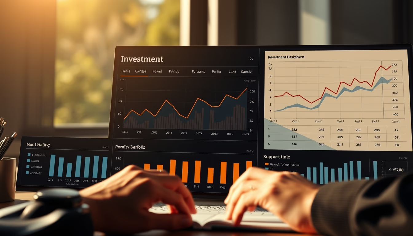
Interactive dashboard showing a detailed portfolio breakdown with a pie chart and real-time performance indicators.
About this subject
Investment dashboards are essential tools for institutional and individual investors to track asset allocation. The pie chart in the image represents the proportion of each asset class (stocks, fixed income, real estate funds, etc.) in the total portfolio. This visualization allows quick identification of concentrations or imbalances, aiding decision-making.
In Brazil, the fintech market grew 40% between 2020 and 2023, driving the adoption of digital investment platforms. Many brokerages offer customizable dashboards with real-time data integrated via APIs from exchanges like B3. The natural morning light captured in the documentary photography evokes the start of an analyst's workday, when updates from Asian and European markets influence early decisions.
The presence of multiple charts and indicators (such as profitability, volatility, and Sharpe ratio) reflects the complexity of modern portfolio management. Business intelligence (BI) technology enables drill-down into each asset, offering historical metrics and projections. Companies like XP Inc. and BTG Pactual invest heavily in UX to make these dashboards accessible even to beginner investors, democratizing access to information once restricted to large players.
Frequently Asked Questions
What is an investment dashboard?
It is a visual interface that consolidates real-time financial data, displaying metrics such as returns, asset allocation, and risks, enabling monitoring and decision-making.
Why is a pie chart important in a portfolio?
The pie chart shows the proportion of each asset class, making it easy to visualize diversification and identify excessive concentrations that increase risk.
How does natural light in the photo relate to the theme?
The natural morning light symbolizes the start of an analyst's workday, a common time to review portfolios and react to movements in global markets.
Direct URL
https://pub-c7d6a6ea828543ac903a74a341ccb2e1.r2.dev/imagens/investment-dashboard-with-portfolio-breakdown-chart-documentary-photography-morning-natural-light.avifHow to credit
Include a visible link back to UtilizAí. Copy one of the snippets below:
<a href="https://xn--utiliza-eza.com/en/midia/imagens/investment-dashboard-with-portfolio-breakdown-chart-documentary-photography-morning-natural-light">Investment dashboard with portfolio breakdown chart</a> by <a href="https://xn--utiliza-eza.com">UtilizAí</a>, licensed under <a href="https://creativecommons.org/licenses/by/4.0/">CC BY 4.0</a>.
[Investment dashboard with portfolio breakdown chart](https://xn--utiliza-eza.com/en/midia/imagens/investment-dashboard-with-portfolio-breakdown-chart-documentary-photography-morning-natural-light) by [UtilizAí](https://xn--utiliza-eza.com), CC BY 4.0
License: CC-BY-4.0