Investment dashboard with portfolio breakdown chart
1344×768 · AVIF · CC BY 4.0
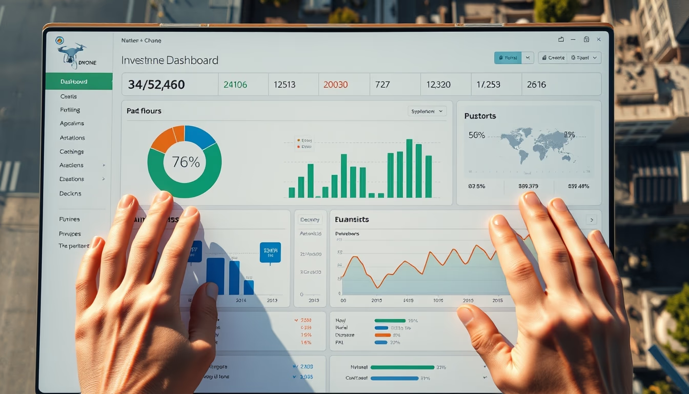
Financial dashboard showing portfolio allocation chart with real-time market data, used by investors for decision-making.
About this subject
Investment dashboards are essential tools in modern finance, allowing investors to monitor their portfolios in a consolidated view. The pie or donut chart often present in these dashboards represents asset allocation, dividing capital among stocks, fixed income, real estate funds, and other instruments. This visualization helps quickly identify exposure to each asset class and verify if the portfolio aligns with the investor's risk profile.
In Brazil, dashboard usage has grown with the popularization of digital brokerages and robo-advisors. Platforms like Clear, Rico, and ModalMais offer these features to retail clients. Globally, tools such as Bloomberg Terminal and Morningstar Direct are benchmarks, but cloud-based solutions like Tableau and Power BI are also widely adopted by asset managers.
A technical curiosity: building a portfolio chart requires calculating weighted returns and adjusting for dividends and interest on equity. Data update frequency ranges from real-time to daily, depending on the source. Modern dashboards also incorporate risk metrics like standard deviation and Sharpe ratio, enabling analysis beyond simple allocation.
The fintech market has driven demand for interactive dashboards. Startups like American Personal Capital and Brazilian Gorila offer account aggregation and automated reports. For institutional investors, the ability to export data to pricing and compliance models is crucial. The trend is for these dashboards to become more predictive, using artificial intelligence to suggest rebalancing.
Frequently Asked Questions
What is an investment dashboard?
It is a visual tool that consolidates financial information of a portfolio, such as balances, returns, and asset allocation, facilitating monitoring and decision-making.
How to interpret a portfolio chart?
The chart shows the percentage distribution of capital among different asset classes. Each slice represents an investment type, and its size indicates the allocated proportion.
What risk metrics are common in dashboards?
Standard deviation, Sharpe ratio, beta, and Value at Risk (VaR) are frequently used to assess portfolio volatility and risk-adjusted return.
Direct URL
https://pub-c7d6a6ea828543ac903a74a341ccb2e1.r2.dev/imagens/investment-dashboard-with-portfolio-breakdown-chart-aerial-drone-shot-bright-midday-sun.avifHow to credit
Include a visible link back to UtilizAí. Copy one of the snippets below:
<a href="https://xn--utiliza-eza.com/en/midia/imagens/investment-dashboard-with-portfolio-breakdown-chart-aerial-drone-shot-bright-midday-sun">Investment dashboard with portfolio breakdown chart</a> by <a href="https://xn--utiliza-eza.com">UtilizAí</a>, licensed under <a href="https://creativecommons.org/licenses/by/4.0/">CC BY 4.0</a>.
[Investment dashboard with portfolio breakdown chart](https://xn--utiliza-eza.com/en/midia/imagens/investment-dashboard-with-portfolio-breakdown-chart-aerial-drone-shot-bright-midday-sun) by [UtilizAí](https://xn--utiliza-eza.com), CC BY 4.0
License: CC-BY-4.0