Investment dashboard with portfolio breakdown chart
1344×768 · AVIF · CC BY 4.0
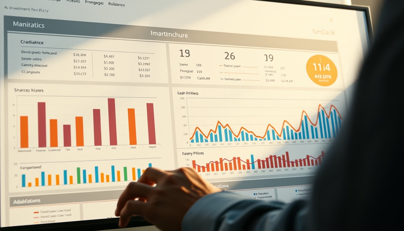
Interactive dashboard showing a pie chart of portfolio composition, indicating asset class allocation.
About this subject
The investment dashboard with portfolio breakdown chart is an essential tool for investors who want to monitor their asset allocation in real time. The pie chart displayed on the screen details the allocation by asset class, such as stocks, fixed income, real estate funds, and international assets. This visualization allows quick identification of portfolio imbalances, such as excessive exposure to a single sector or low diversification.
Developed by fintech platforms, this type of dashboard usually aggregates data from multiple brokers and banks, consolidating the investor's wealth in one place. The modern interface, with a light background and minimalist icons, facilitates reading even on mobile devices. In addition to the pie chart, it is common to include profitability indicators, volatility, and comparisons with benchmarks such as the Ibovespa or CDI.
In Brazil, the use of investment dashboards has grown with the popularization of robo-advisors and financial advisory platforms. The image, captured in a cinematic wide shot with morning natural light, conveys a sense of clarity and professionalism, ideal for marketing materials of fintech companies. The presence of a well-defined pie chart suggests that the user has full control over their allocation decisions, a fundamental principle of modern data-driven investing.
Frequently Asked Questions
What is an investment dashboard?
It is a visual interface that consolidates financial information such as balance, returns, and portfolio composition in easy-to-read charts and tables.
How does a pie chart help with portfolio management?
It shows the proportion of each asset class in the portfolio, allowing investors to check if the allocation aligns with their risk profile and goals.
What data is commonly found in an investment dashboard?
Beyond the pie chart, it includes cumulative returns, volatility, benchmark comparisons, and a list of assets with their respective weights.
Direct URL
https://pub-c7d6a6ea828543ac903a74a341ccb2e1.r2.dev/imagens/investment-dashboard-with-portfolio-breakdown-chart-cinematic-wide-shot-morning-natural-light.avifHow to credit
Include a visible link back to UtilizAí. Copy one of the snippets below:
<a href="https://xn--utiliza-eza.com/en/midia/imagens/investment-dashboard-with-portfolio-breakdown-chart-cinematic-wide-shot-morning-natural-light">Investment dashboard with portfolio breakdown chart</a> by <a href="https://xn--utiliza-eza.com">UtilizAí</a>, licensed under <a href="https://creativecommons.org/licenses/by/4.0/">CC BY 4.0</a>.
[Investment dashboard with portfolio breakdown chart](https://xn--utiliza-eza.com/en/midia/imagens/investment-dashboard-with-portfolio-breakdown-chart-cinematic-wide-shot-morning-natural-light) by [UtilizAí](https://xn--utiliza-eza.com), CC BY 4.0
License: CC-BY-4.0