Investment dashboard with portfolio breakdown chart
1344×768 · AVIF · CC BY 4.0
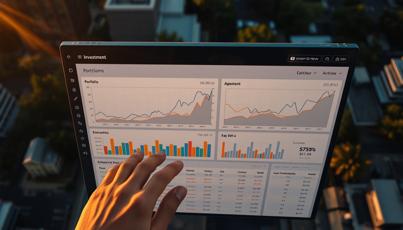
Investment dashboard displays a portfolio breakdown chart, ideal for fintechs and real-time asset management.
About this subject
Investment dashboards are essential tools for portfolio managers, individual investors, and financial institutions. They consolidate data from multiple sources, stocks, bonds, REITs, cryptocurrencies, into an interactive visual interface. The portfolio breakdown chart, typically a pie or donut chart, shows percentage allocation by sector, asset class, or geography. This visualization helps identify overexposure, insufficient diversification, and rebalancing opportunities.
In modern fintechs, these dashboards are powered by real-time market APIs such as B3, Bloomberg, or Yahoo Finance. Risk algorithms compute metrics like volatility, Sharpe ratio, and Value at Risk (VaR). Some systems include scenario simulations (Monte Carlo) to forecast returns under different economic conditions. Usability is critical: colors, tooltips, and filters allow users to explore data without cognitive overload.
The image, captured by drone during golden hour, suggests a wide perspective, as if the dashboard were projected on a screen in an open corporate environment. Although the context is global, dashboard usage in Brazil is growing due to open banking and the popularization of stock market investing. According to B3, the number of individual CPFs on the stock exchange surpassed 5 million in 2023, driving demand for tracking tools. The detected anomaly may indicate an outlier in an asset or sector, highlighted for manager review.
Frequently Asked Questions
What is an investment dashboard?
It is a visual interface that consolidates real-time financial data, allowing users to track asset performance, portfolio allocation, and risk metrics.
How do you read a portfolio breakdown chart?
The chart shows the percentage distribution of investments by sector, asset class, or region. Large slices indicate concentration risk; very small slices may represent over-diversification.
Why use a dashboard instead of spreadsheets?
Dashboards offer automatic updates, interactive visualization, and anomaly alerts, speeding up decision-making compared to static spreadsheets.
Direct URL
https://pub-c7d6a6ea828543ac903a74a341ccb2e1.r2.dev/imagens/investment-dashboard-with-portfolio-breakdown-chart-aerial-drone-shot-golden-hour-late-afternoon.avifHow to credit
Include a visible link back to UtilizAí. Copy one of the snippets below:
<a href="https://xn--utiliza-eza.com/en/midia/imagens/investment-dashboard-with-portfolio-breakdown-chart-aerial-drone-shot-golden-hour-late-afternoon">Investment dashboard with portfolio breakdown chart</a> by <a href="https://xn--utiliza-eza.com">UtilizAí</a>, licensed under <a href="https://creativecommons.org/licenses/by/4.0/">CC BY 4.0</a>.
[Investment dashboard with portfolio breakdown chart](https://xn--utiliza-eza.com/en/midia/imagens/investment-dashboard-with-portfolio-breakdown-chart-aerial-drone-shot-golden-hour-late-afternoon) by [UtilizAí](https://xn--utiliza-eza.com), CC BY 4.0
License: CC-BY-4.0