Investment dashboard with portfolio breakdown chart
1344×768 · AVIF · CC BY 4.0
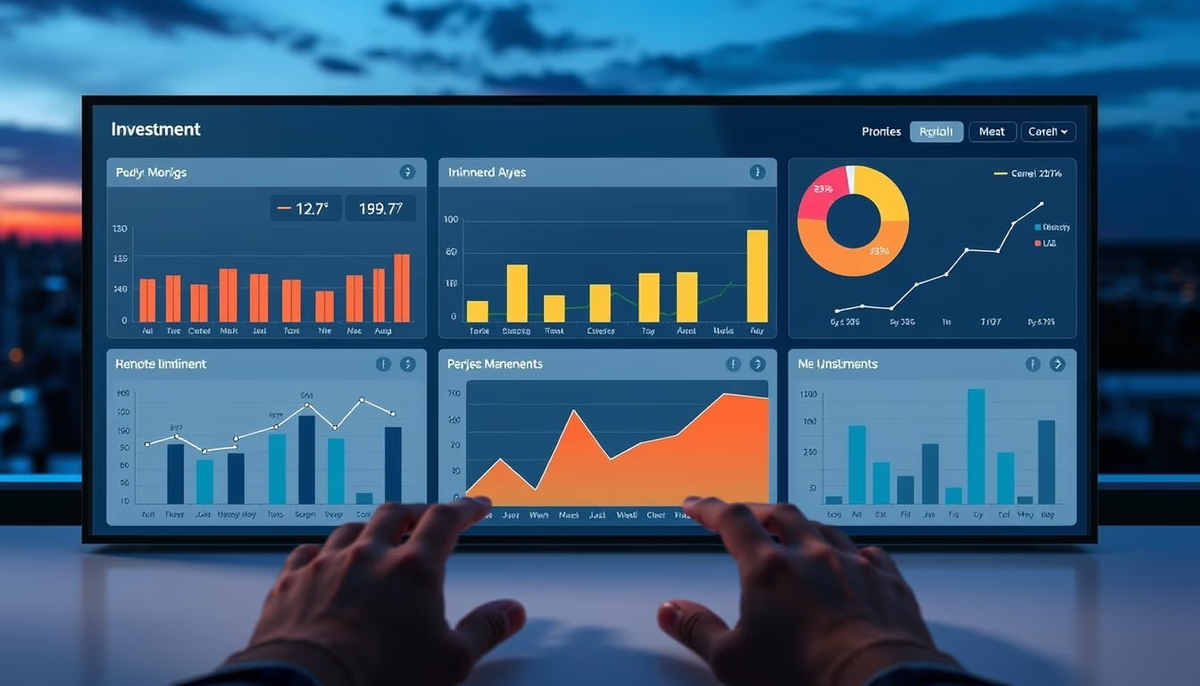
Investment dashboard with portfolio breakdown chart displays real-time asset allocation for financial decision-making.
About this subject
An investment dashboard is an essential tool for investors and portfolio managers to track asset performance. It consolidates data from multiple sources such as stocks, bonds, real estate funds, and cryptocurrencies into a visual interface. The portfolio breakdown chart, often a pie or stacked bar chart, shows the proportion of each asset class, enabling diversification checks and rebalancing decisions.
The symmetric composition and twilight blue hour setting suggest a nighttime analysis environment, common in global markets operating 24/7. Cool blue tones convey professionalism and trust, while symmetry indicates data balance. This visualization is typical in platforms like Bloomberg Terminal, Morningstar, or fintech apps such as Nubank and XP Investimentos.
The "business" category and tags like "fintech" and "global" reflect application in financial technology companies offering personalized reports. The portfolio chart helps investors avoid overconcentration in a single asset, following Markowitz's efficient frontier principles. Historical data shows that diversified portfolios reduce volatility without sacrificing long-term returns.
Interestingly, the twilight blue hour is a photographic period that also represents the transition between day and night, metaphorically associated with risk and opportunity analysis in markets. The symmetric composition reinforces the idea of balance between risk and return, a core concept in modern portfolio theory.
Frequently Asked Questions
What is an investment dashboard?
It is a visual interface that consolidates financial data from multiple assets, allowing real-time tracking of performance, allocation, and metrics.
How does the portfolio breakdown chart help with diversification?
It shows the proportion of each asset class, making it easy to identify overconcentration and guide rebalancing to reduce risk.
Which platforms use this type of visualization?
Bloomberg Terminal, Morningstar, and fintech apps like Nubank, XP Investimentos, and Robinhood use dashboards with portfolio charts.
Direct URL
https://pub-c7d6a6ea828543ac903a74a341ccb2e1.r2.dev/imagens/investment-dashboard-with-portfolio-breakdown-chart-symmetric-composition-twilight-blue-hour.avifHow to credit
Include a visible link back to UtilizAí. Copy one of the snippets below:
<a href="https://xn--utiliza-eza.com/en/midia/imagens/investment-dashboard-with-portfolio-breakdown-chart-symmetric-composition-twilight-blue-hour">Investment dashboard with portfolio breakdown chart</a> by <a href="https://xn--utiliza-eza.com">UtilizAí</a>, licensed under <a href="https://creativecommons.org/licenses/by/4.0/">CC BY 4.0</a>.
[Investment dashboard with portfolio breakdown chart](https://xn--utiliza-eza.com/en/midia/imagens/investment-dashboard-with-portfolio-breakdown-chart-symmetric-composition-twilight-blue-hour) by [UtilizAí](https://xn--utiliza-eza.com), CC BY 4.0
License: CC-BY-4.0