Investment dashboard with portfolio breakdown chart
1344×768 · AVIF · CC BY 4.0
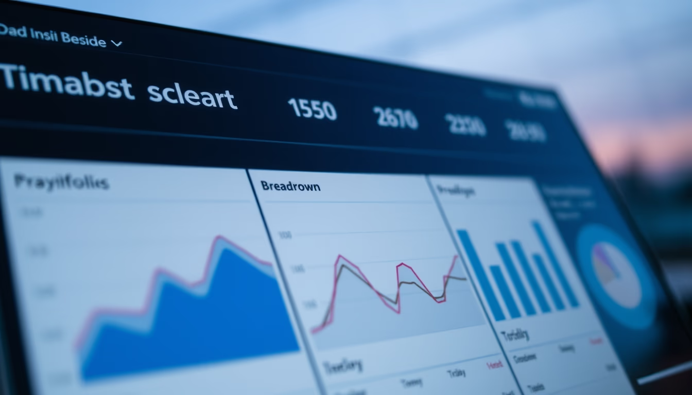
Investment dashboard displaying portfolio allocation chart, an essential tool for personal finance and market analysis.
About this subject
Investment dashboards are digital panels that consolidate real-time financial information, allowing investors to track their portfolio performance. They integrate data from multiple sources, such as brokerages and banks, and display metrics like returns, volatility, and sector exposure. The portfolio breakdown chart, often a pie or stacked bar chart, shows the percentage distribution across asset classes (stocks, fixed income, real estate funds, etc.), facilitating strategic rebalancing.
The popularity of these dashboards has grown with the rise of fintechs and investment platforms like XP Investimentos, BTG Pactual, and Rico. In Brazil, the capital market reached a record 5 million investors on the B3 stock exchange in 2023, driven by falling Selic rates and financial digitalization. Tools like this help avoid common mistakes, such as overconcentration in a single asset or sector.
The nighttime visualization, with a dark background and blue tones (twilight blue hour), is a trend in modern interfaces, reducing eye strain and highlighting data. The close-up macro shot focuses on chart details, simulating a smartphone or tablet screen used by investors on the go. This design is common in apps like TradeMap, MyProfit, and Gorila, which offer customizable dashboards for different risk profiles.
Frequently Asked Questions
What is an investment dashboard?
It is a digital tool that consolidates financial information from an investment portfolio into a single panel, displaying charts, performance indicators, and asset allocation in real time.
Why is the portfolio breakdown chart important?
It shows the percentage distribution of investments across different asset classes, helping investors check if the portfolio is diversified and aligned with their risk profile.
What is the advantage of dark mode in dashboards?
Dark mode, like night blue, reduces eye strain in low-light environments and highlights colored data, making it preferred by many investors who monitor markets at night.
Direct URL
https://pub-c7d6a6ea828543ac903a74a341ccb2e1.r2.dev/imagens/investment-dashboard-with-portfolio-breakdown-chart-closeup-macro-shot-twilight-blue-hour.avifHow to credit
Include a visible link back to UtilizAí. Copy one of the snippets below:
<a href="https://xn--utiliza-eza.com/en/midia/imagens/investment-dashboard-with-portfolio-breakdown-chart-closeup-macro-shot-twilight-blue-hour">Investment dashboard with portfolio breakdown chart</a> by <a href="https://xn--utiliza-eza.com">UtilizAí</a>, licensed under <a href="https://creativecommons.org/licenses/by/4.0/">CC BY 4.0</a>.
[Investment dashboard with portfolio breakdown chart](https://xn--utiliza-eza.com/en/midia/imagens/investment-dashboard-with-portfolio-breakdown-chart-closeup-macro-shot-twilight-blue-hour) by [UtilizAí](https://xn--utiliza-eza.com), CC BY 4.0
License: CC-BY-4.0