Gradient pastel pink blue
1344×768 · AVIF · CC BY 4.0
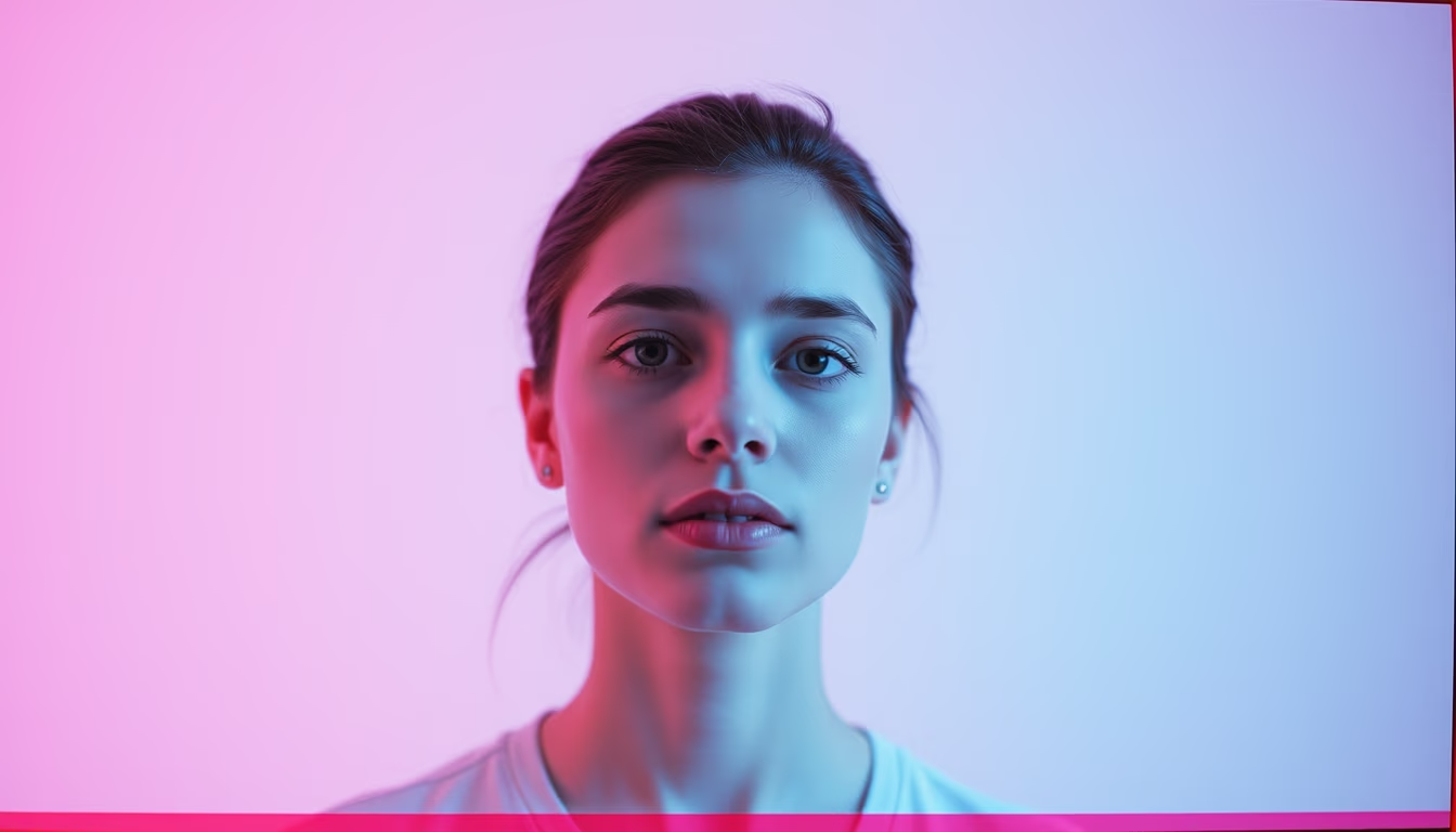
Pastel pink and blue gradients evoke nostalgia and softness, common in lo-fi aesthetics and 1990s disposable camera photography.
About this subject
Gradients are smooth transitions between two or more colors, widely used in graphic design, web design, and photography to create depth and atmosphere. The combination of pastel pink and pastel blue is particularly popular for evoking calmness, nostalgia, and femininity, often found in aesthetics like vaporwave, lo-fi, and soft grunge. In color theory, pastels are created by adding white to saturated hues, resulting in light, delicate shades that remind of childhood and emotional memories.
The lo-fi disposable camera aesthetic gained traction in the 1990s with cameras like the Kodak FunSaver and Fuji Quicksnap. These cameras produced grainy, low-contrast images with chromatic distortions, effects now digitally recreated through apps and filters. Pastel gradients are frequently used as backgrounds or light effects in this style, imitating the imperfection and vintage charm of lab-developed photos.
In Brazil, the nostalgia for the 1990s and the analog revival have boosted the use of pastel gradients in fashion brands, social media, and advertising campaigns. The pink and blue palette reminds of tropical sunsets, appearing in packaging, logos, and decoration. Technically, gradients can be linear or radial, and their digital creation is straightforward in software like Photoshop, Illustrator, or even CSS for web.
Interestingly, the popularity of this color combination is also linked to "barbiecore" and self-love, as pink is associated with affection and blue with trust. In photography, the pastel effect is achieved by controlled overexposure or using plastic lenses, like those from disposable cameras. Although seemingly simple, the harmony between these colors requires balanced brightness and saturation to avoid looking dull or artificial.
Frequently Asked Questions
What are pastel gradients?
Pastel gradients are smooth transitions between low-saturation, high-lightness colors, such as light pink and blue. They are widely used in design and photography to create nostalgic and soft atmospheres.
What is the origin of the lo-fi disposable camera aesthetic?
The lo-fi aesthetic originated with disposable cameras popular in the 1990s, like the Kodak FunSaver. It features grainy, low-contrast, desaturated photos, now digitally mimicked to evoke nostalgia.
Why do pastel pink and blue work so well together?
Pastel pink and blue are analogous colors on the color wheel, balancing cool and warm tones. Psychologically, pink conveys affection and blue calmness, creating visual harmony reminiscent of emotional memories and sunsets.
Direct URL
https://pub-c7d6a6ea828543ac903a74a341ccb2e1.r2.dev/imagens/gradient-pastel-pink-blue-lo-fi-disposable-camera-p0.avifHow to credit
Include a visible link back to UtilizAí. Copy one of the snippets below:
<a href="https://xn--utiliza-eza.com/en/midia/imagens/gradient-pastel-pink-blue-lo-fi-disposable-camera-p0">Gradient pastel pink blue</a> by <a href="https://xn--utiliza-eza.com">UtilizAí</a>, licensed under <a href="https://creativecommons.org/licenses/by/4.0/">CC BY 4.0</a>.
[Gradient pastel pink blue](https://xn--utiliza-eza.com/en/midia/imagens/gradient-pastel-pink-blue-lo-fi-disposable-camera-p0) by [UtilizAí](https://xn--utiliza-eza.com), CC BY 4.0
License: CC-BY-4.0