Gradient pastel pink blue
1344×768 · AVIF · CC BY 4.0
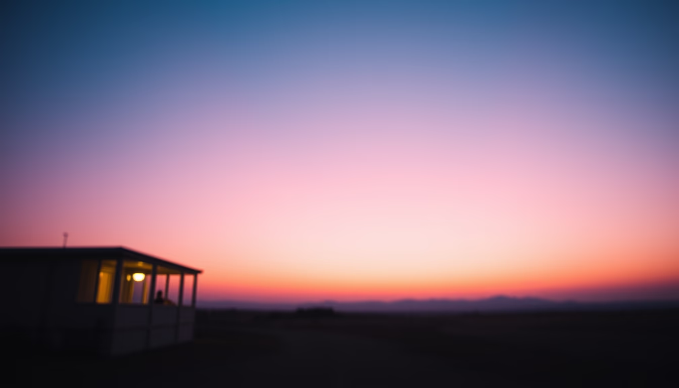
Pastel pink and blue gradients create a soft and contemporary aesthetic, widely used in digital design and branding to convey calm and modernity.
About this subject
Pastel gradients, especially in pink and blue tones, are a powerful visual tool in contemporary design. They evoke feelings of tranquility, freshness, and lightness, often used in app interfaces, websites, and brand identities that aim for a friendly and approachable image. The combination of these two colors recalls dawn or sunset skies, creating a dreamy and welcoming atmosphere.
In Brazil, pastel gradients gained momentum with the minimalist and flat design aesthetics popularized from the 2010s onward. Beauty, fashion, and technology brands adopted this palette to stand out, associating themselves with values like softness, innovation, and well-being. Companies such as Nubank and Amaro use variations of pink and blue in their logos and interfaces, reinforcing a modern and uncomplicated identity.
The pastel gradient trend for 2026 points to an even more subtle chromatic evolution, with almost imperceptible transitions and grainy textures reminiscent of 1980s nostalgia. This approach seeks to humanize digital spaces, adding warmth and depth to screens. Studies in color psychology indicate that pastel shades can reduce anxiety and increase comfort, making them ideal for long-exposure virtual environments.
Interestingly, the pink and blue pastel gradient is also associated with Japanese kawaii culture and the vaporwave movement, which revives aesthetic elements from the 80s and 90s. This global influence makes the palette universally recognized as a symbol of creativity and youth. For designers, mastering the smooth transition between these colors is a valued skill, especially in projects requiring a striking yet delicate visual identity.
Frequently Asked Questions
What are pastel gradients?
They are smooth transitions between low-saturation, high-luminosity colors, such as pastel pink and pastel blue. They create a delicate and modern visual effect, widely used in digital design and branding.
Why are pastel pink and blue often combined?
The combination evokes balance and harmony, reminiscent of natural landscapes like sunrise. Psychologically, it is associated with calm, trust, and affection, making it effective for brands seeking to convey softness and innovation.
How can pastel gradients be used in design projects?
They can be applied in website backgrounds, app interfaces, logos, and graphic materials. For best results, use subtle transitions and avoid strong contrasts to maintain text readability. Tools like CSS and editing software make it easy to create these effects.
Direct URL
https://pub-c7d6a6ea828543ac903a74a341ccb2e1.r2.dev/imagens/gradient-pastel-pink-blue-cinematic-wide-shot-p2.avifHow to credit
Include a visible link back to UtilizAí. Copy one of the snippets below:
<a href="https://xn--utiliza-eza.com/en/midia/imagens/gradient-pastel-pink-blue-cinematic-wide-shot-p2">Gradient pastel pink blue</a> by <a href="https://xn--utiliza-eza.com">UtilizAí</a>, licensed under <a href="https://creativecommons.org/licenses/by/4.0/">CC BY 4.0</a>.
[Gradient pastel pink blue](https://xn--utiliza-eza.com/en/midia/imagens/gradient-pastel-pink-blue-cinematic-wide-shot-p2) by [UtilizAí](https://xn--utiliza-eza.com), CC BY 4.0
License: CC-BY-4.0