Gradient pastel pink blue
1344×768 · AVIF · CC BY 4.0
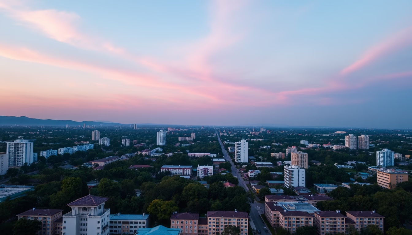
Pastel pink and blue gradient: an aesthetic trend blending softness and modernity in digital design, decor, and fashion.
About this subject
The combination of pastel pink and pastel blue in a gradient has become a visual hallmark in contemporary design, especially since the mid-2010s. This palette, often associated with the vaporwave aesthetic and retro Macintosh design, evokes nostalgia while conveying freshness and innovation. Globally, it has been adopted by brands in cosmetics, wellness apps, and even interior architecture, where soft gradient walls create cozy atmospheres and expand the sense of space.
Chromatically, pastel pink symbolizes delicacy, affection, and creativity, while pastel blue represents calmness, trust, and serenity. Together, they form a harmonious contrast that appeals to both young and adult audiences. Color psychology studies suggest this combination can reduce anxiety and enhance focus, making it popular in meditation and productivity app interfaces.
In visual culture, pastel gradients appear in fashion campaigns, music festivals like Coachella, and digital art, including NFTs that exploit smooth color transitions to create depth and motion. The versatility of this palette allows its use in logos, packaging, and even in web design, where it softens user interfaces.
The rise of pastel gradients also reflects a broader design shift: companies like Instagram and Spotify have incorporated soft gradients into their branding. This trend, predicted to peak around 2026, underscores the quest for visual experiences that balance technology with emotion, connecting users to feelings of lightness and well-being.
Frequently Asked Questions
What is a pastel gradient?
A pastel gradient is a smooth transition between two or more pastel colors, such as pink and blue, creating a seamless and soft visual effect. It is widely used in graphic design, digital interfaces, and fashion.
Why is the pastel pink and blue combination so popular?
It combines the delicacy of pink with the calmness of blue, creating a balanced aesthetic that evokes nostalgia and modernity. This palette appeals to diverse audiences and is versatile for various applications.
How to apply pastel gradients in design projects?
Use tools like Adobe Illustrator or CSS to create linear or radial transitions. Combine pastel pink and blue in backgrounds, buttons, or typography, ensuring enough contrast for readability.
Direct URL
https://pub-c7d6a6ea828543ac903a74a341ccb2e1.r2.dev/imagens/gradient-pastel-pink-blue-aerial-drone-shot-p4.avifHow to credit
Include a visible link back to UtilizAí. Copy one of the snippets below:
<a href="https://xn--utiliza-eza.com/en/midia/imagens/gradient-pastel-pink-blue-aerial-drone-shot-p4">Gradient pastel pink blue</a> by <a href="https://xn--utiliza-eza.com">UtilizAí</a>, licensed under <a href="https://creativecommons.org/licenses/by/4.0/">CC BY 4.0</a>.
[Gradient pastel pink blue](https://xn--utiliza-eza.com/en/midia/imagens/gradient-pastel-pink-blue-aerial-drone-shot-p4) by [UtilizAí](https://xn--utiliza-eza.com), CC BY 4.0
License: CC-BY-4.0