Gradient pastel pink blue
1344×768 · AVIF · CC BY 4.0
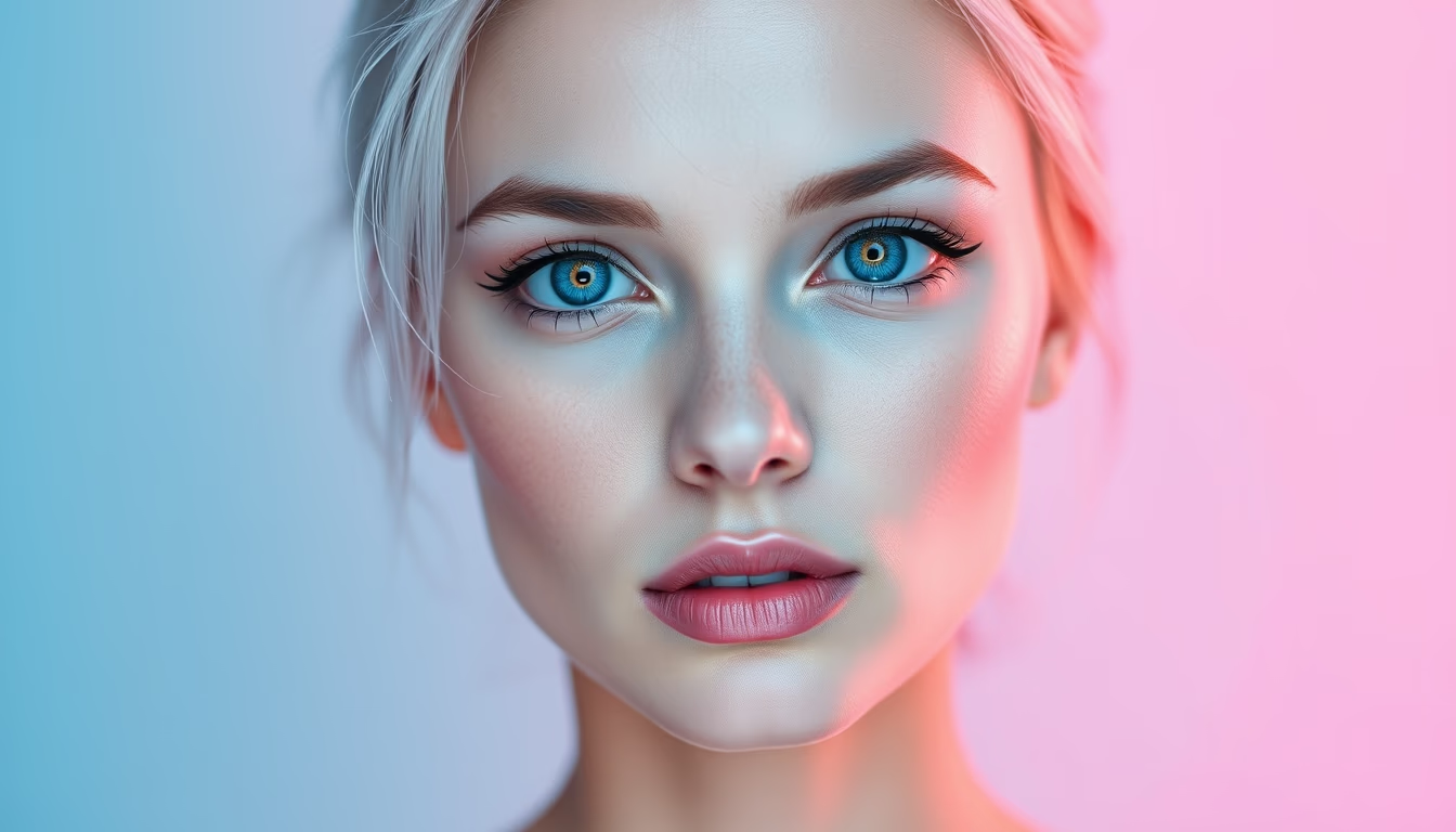
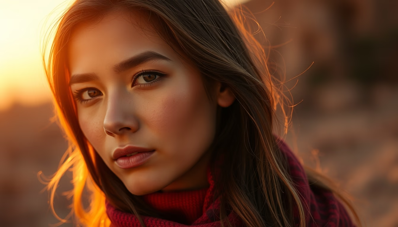
Pastel pink blue gradients blend visual delicacy and design trends for soft, contemporary compositions.
About this subject
Pastel pink and blue gradients stand out as one of the key aesthetic trends for 2026, especially in graphic design and editorial photography. This color combination evokes softness and balance, widely used in fashion campaigns, brand identities, and social media. Pastel pink, associated with tenderness and modernity, contrasts harmoniously with pastel blue, which conveys calm and trust. Together, they create an ethereal and welcoming atmosphere, ideal for brands seeking delicate and sophisticated communication.
From a technical standpoint, pastel gradients are achieved by mixing colors with high luminosity and low saturation. Various editing software, such as Adobe Photoshop or Figma, allow smooth transitions between the tones, ranging from linear to radial variations. This technique gained prominence in digital design from the 2010s onward, with the popularization of flat design and material design, evolving into more organic and ethereal approaches.
Culturally, the pastel pink-blue palette references movements like Art Deco and the Memphis style, revisited with a contemporary lens. In Brazil, pastel colors are common in decoration and beachwear, associated with a tropical and modern lifestyle. The 2026 trend reflects a search for visual comfort and nostalgia, as a counterpoint to digital overstimulation. Therefore, these gradients appear in website backgrounds, album covers, and even architecture, such as colored glass facades.
Beyond aesthetics, the choice of pastel pink and blue carries psychological implications. Pink stimulates creativity and empathy, while blue promotes focus and serenity. This duality makes the combination versatile across niches, from wellness clinics to tech startups. In fashion editorials, for instance, pastel gradients can serve as a backdrop to highlight neutral or metallic clothing, creating a visually rich and modern composition.
Frequently Asked Questions
What are pastel gradients?
Pastel gradients are smooth transitions between colors with high luminosity and low saturation, such as light pink and blue. They create an ethereal visual effect and are popular in graphic design, fashion, and photography.
Why is the pastel pink and blue combination so used in design?
This combination balances softness and contrast. Pastel pink conveys modernity and empathy, while pastel blue conveys calm and trust. Together, they are versatile and appeal to diverse audiences, aligning with current aesthetic trends.
How to apply pastel gradients in design projects?
They can be used as backgrounds for websites, brand identities, social media posts, or wallpapers. Tools like Photoshop and Figma allow creating linear or radial gradients. Adjusting opacity and colors is important to ensure readability and harmony with other elements.
Direct URL
https://pub-c7d6a6ea828543ac903a74a341ccb2e1.r2.dev/imagens/gradient-pastel-pink-blue-studio-editorial-portrait-p3.avifHow to credit
Include a visible link back to UtilizAí. Copy one of the snippets below:
<a href="https://xn--utiliza-eza.com/en/midia/imagens/gradient-pastel-pink-blue-studio-editorial-portrait-p3">Gradient pastel pink blue</a> by <a href="https://xn--utiliza-eza.com">UtilizAí</a>, licensed under <a href="https://creativecommons.org/licenses/by/4.0/">CC BY 4.0</a>.
[Gradient pastel pink blue](https://xn--utiliza-eza.com/en/midia/imagens/gradient-pastel-pink-blue-studio-editorial-portrait-p3) by [UtilizAí](https://xn--utiliza-eza.com), CC BY 4.0
License: CC-BY-4.0