DeFi yield aggregator dashboard showing APY rates across protocols
1344×768 · AVIF · CC BY 4.0
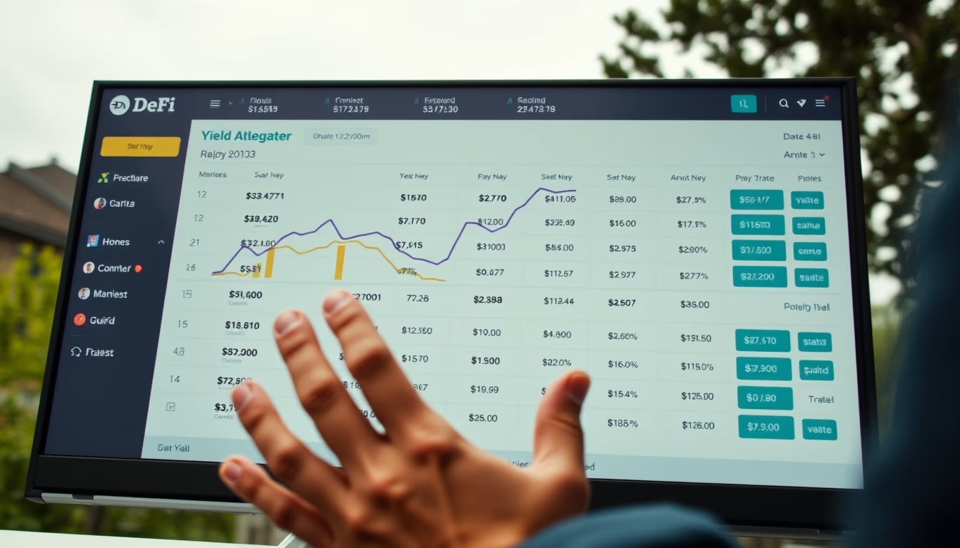
DeFi yield aggregator dashboards display real-time APY across protocols, enabling comparison of profitability and risk.
About this subject
Yield aggregators are platforms that automate the search for the highest returns across decentralized finance (DeFi) protocols. They analyze interest rates, liquidity rewards, and farming opportunities on various blockchains such as Ethereum, BNB Chain, and Polygon. The typical dashboard displays metrics like APY (Annual Percentage Yield), TVL (Total Value Locked), and historical returns, enabling investors to compare options without accessing each protocol individually.
The importance of aggregators grew with the fragmentation of the DeFi ecosystem, which now includes hundreds of protocols. Tools like Yearn Finance, Beefy Finance, and Harvest Finance popularized the concept, offering vaults that automatically reinvest earnings to maximize compound interest. The dashboard centralizes information from smart contracts, liquidity pools, and yield farming strategies, often with risk classification and lock-up periods.
A technical curiosity is that these dashboards frequently use oracles and indexers to update data in real time, but the displayed APY is a projection based on past conditions, not a future guarantee. Users must consider risks such as impermanent loss, contract attacks, and rate volatility. In 2023, the yield aggregator market moved over $10 billion in TVL, with notable strategies involving stablecoins.
Dashboard design prioritizes visual clarity: line charts for trends, sortable tables by APY, and filters by blockchain or asset type. Some platforms integrate profitability calculators and rate change alerts. User experience is crucial, as investment decisions depend on accurate and timely data.
Frequently Asked Questions
What is a yield aggregator in DeFi?
It is a platform that automates the search for the best returns across DeFi protocols, consolidating APY, TVL, and risk information into a single dashboard for comparison.
Is the APY shown on dashboards guaranteed?
No, APY is a projection based on historical data and current conditions. It can change due to protocol rate changes, market volatility, and risks such as impermanent loss.
What risks should I consider when using yield aggregators?
Risks include impermanent loss in liquidity pools, smart contract failures, hacking attacks, and interest rate fluctuations. It is important to diversify and understand each strategy.
Direct URL
https://pub-c7d6a6ea828543ac903a74a341ccb2e1.r2.dev/imagens/defi-yield-aggregator-dashboard-showing-apy-rates-across-protocols-documentary-photography-overcast-soft-daylight.avifHow to credit
Include a visible link back to UtilizAí. Copy one of the snippets below:
<a href="https://xn--utiliza-eza.com/en/midia/imagens/defi-yield-aggregator-dashboard-showing-apy-rates-across-protocols-documentary-photography-overcast-soft-daylight">DeFi yield aggregator dashboard showing APY rates across protocols</a> by <a href="https://xn--utiliza-eza.com">UtilizAí</a>, licensed under <a href="https://creativecommons.org/licenses/by/4.0/">CC BY 4.0</a>.
[DeFi yield aggregator dashboard showing APY rates across protocols](https://xn--utiliza-eza.com/en/midia/imagens/defi-yield-aggregator-dashboard-showing-apy-rates-across-protocols-documentary-photography-overcast-soft-daylight) by [UtilizAí](https://xn--utiliza-eza.com), CC BY 4.0
License: CC-BY-4.0
Tags
Related images
 Stablecoin minting interface showing collateralization ratio
 Stablecoin minting interface showing collateralization ratio
 Stablecoin minting interface showing collateralization ratio
 Stablecoin minting interface showing collateralization ratio
 Stablecoin minting interface showing collateralization ratio
 Stablecoin minting interface showing collateralization ratio